A data analysis project focused on capturing and visualizing the audio features of several popular Spotify playlists, including some of your favorites
Motivation
As an avid consumer of streaming music, I’m constantly finding myself in awe of Spotify‘s uncanny ability to recommend playlists that contain fresh “new” music tracks (which I truly enjoy), introducing me to novel artists and sounds that keep my listening queue from becoming repetitive and dull. The wizard behind this magic is, of course, is machine learning (ML). And Spotify is deep into ML.
When I first sat down to brainstorm this project, it was my plan to use data obtained from Spotify’s Web API to build and train a music recommendation system. However, I was disappointed to learn that Spotify’s terms of service specifically prohibit developers from using their platform or data for the purpose of training ML models. And since I’m someone that usually plays by the rules, I decided to redirect my objectives to focus on the types of fundamental data analysis required before an ML model is designed: building a data pipeline and performing basic data exploration. This project accomplishes those tasks.
Summary
This project contains two Google Colab notebooks which (1) use Spotify’s Web API and the Pandas library to collect, process, and export a dataset containing audio features for tracks appearing on several public Spotify playlists; and (2) use the Matplotlib and Seaborn libraries to generate rich graphics, visually illustrating statistics of the dataset’s many categorical and quantitative features.
All files related to this project can be accessed from the project’s shared Google Drive folder. Before diving into the code, please check out the contained Readme file as well as the following important notes:
- The Colab notebooks (the .ipynb files) are fully interactive (except for the caveat mentioned below). Anyone can execute the code from their own web browser, with processes running on a Google virtual machine. Simply type Cmd/Ctrl+Enter (or click the “play” button) to execute the code in a selected cell. A green checkmark next to the cell (along with the run time) will indicate that the process executed successfully.
- That caveat? The interactivity of the first notebook (data.ipynb) requires the user to have a Spotify API key. If you have a Spotify account (even a basic one), setting up the required developer account is straightforward. Follow these steps to do so, and then enter your credentials in the Colab notebook where instructed.
- The second notebook (analysis.ipynb) requires the user to upload a data file for analysis. Users who are unable to produce their own dataset (via data.ipynb) should upload the provided data file (track_data.csv) at this step.
Project details
To follow along, save your own copy of each Colab notebook in the project directory.
Overview of the data
The playlists
Our analysis focuses on audio data (defined next) for tracks appearing in a collection of some of Spotify’s most popular editorial playlists, as well any playlists specified by the user. The default playlists fall into one of two collections:
- Spotify’s “user” playlists, which includes lists of current top tracks as well as popular tracks grouped by genre and decade:
- Today’s Top Hits (50 tracks)
- RapCaviar (51 tracks)
- Hot Country (50 tracks)
- Viva Latino (50 tracks)
- New Music Friday (97 tracks)
- Peaceful Piano (100 tracks)
- Are & Be (49 tracks)
- Rock Classics (100 tracks)
- mint (75 tracks)
- Rock This (50 tracks)
- just hits (100 tracks)
- All Out 2000s (100 tracks)
- All Out 90s (100 tracks)
- All Out 80s (100 tracks)
- All Out 70s (100 tracks)
- All Out 60s (100 tracks)
- All Out 50s (100 tracks)
- Soft Pop Hits (100 tracks)
- Signed XOXO (100 tracks)
- Spotify’s “featured” playlists, which are updated regularly. As of the time of this writing, the following playlists are being featured (note that one of these playlists is also included in the previous grouping):
- Throwback Thursday (50 tracks)
- Happy Hits! (100 tracks)
- Classic Rock Workout (65 tracks)
- my life is a movie (100 tracks)
- B.A.E. (50 tracks)
- All Out 70s (100 tracks)
- Afternoon Acoustic (100 tracks)
- Indigo (100 tracks)
- Guilty Pleasures (100 tracks)
- Stress Relief (100 tracks)
The user is also given the opportunity to include their own playlists in the analysis (via a script built around the input() Python function and Spotipy’s search() endpoint; details in the ETL section). The additional playlists included in the sample dataset (track_data.csv) are:
- Classical Garden (51 tracks)
- Music for Plants (100 tracks)
- Melantronic (50 tracks)
- This Is Nils Frahm (50 tracks)
- The Wind Down (50 tracks)
- Ibiza Sunset (50 tracks)
- This Is Flamingosis (50 tracks)
The features
For each track which appears on any of the playlists included, the following audio features are captured for analysis:
release_dt(date-time), the date the album containing the track was first releaseddurationof the track (float), measured in secondspopularityof the track (integer), on a scale from from 1 to 100 (with 100 corresponding to most popular); calculation is based on both the total number of plays for the track, and the recency of those playsexplicit(boolean), whether the track contains explicit lyricsdance(float), the suitability of the track for dancing, on a scale from 0 to 1 (with 1 corresponding to most danceable); calculation is based on a combination of musical elements including tempo, rhythm stability, beat strength, and overall regularityenergy(float), a perceptual measure of intensity and activity, on a scale from 0 to 1 (with 1 corresponding to most energetic); calculation is based on the track’s dynamic range, perceived loudness, timbre, onset rate, and general entropyloud(float), the average loudness of the track, measured in decibels (dB); values commonly fall between -60 dB and 0 dB (note that Spotify uses loudness normalization, explaining negative values for this metric)speech(float), measuring the presence of spoken word in the track, on a scale from 0 to 1 (for music recordings, values are typically below 0.66, with rap on the upper end of this range)acoustic(float), predicting the acousticness of the track, a confidence measure from 0 to 1 (with 1 representing a high confidence that the track is acoustic)instrument(float), a confidence measure from 0 to 1 indicating the likelihood of the track containing no vocals (values above 0.5 typically indicate tracks with vocals)live(float), a confidence measure from 0 to 1 indicating the presence of an audience in the recording (1 corresponds to a live recording)valence(float), the mood of the track, on a scale from 0 to 1 (with 0 representing tracks which are sad or angry, and 1 representing tracks which are happy or euphoric)tempoestimate (float), averaged over the track, measured in beats per minutekeyof track (integer), having values from -1 to 11, referencing standard pitch class notation (in particular, 0 corresponds to a key of C, 1 corresponds to C♯, and so on; a value of -1 indicates that the key was not detected)mode, or modality of the track’s scale (integer), having a value of 0 (minor scale) or 1 (major scale)time_sig(integer), the track’s estimated time signature, or number of beats per measure (in particular, a value of 3 corresponds to a time signature of 3/4, etc.)
In order to query tracks belonging to particular playlists, the dataset also includes one-hot encoded variables which indicate a particular track’s membership in each playlist.
Data extraction & processing
Please refer to the notebook data.ipynb for the complete code.
Spotipy usage
The project’s data extraction process uses Spotipy, a Python wrapper for the Spotify Web API, with authentication granted through their client credentials protocol. This type of API client provides many methods (aka endpoints) for retrieving public Spotify data (for access to user data, the client authorization code flow is required). Usage of such endpoints in the code is indicated by the presence of the Spotipy client alias, sp. For example,
sp.search('Music for Plants', type='playlist')
is an API call which searches for Spotify playlists relevant to the query “Music for Plants” (the name of one of my favorite Spotify playlists). If such a request is successful, the API will return a JSON object containing the requested data, which we can then process and export to a CSV file for use in the analysis section.
See the Spotipy docs and the Spotify Web API docs for more information about the available API client endpoints, their parameters, and the data structures they return.
ETL pipeline
First we define the collection of playlists which we’d like to include. The default playlists are pretty easy to obtain with simple API calls.
spotify_playlists = sp.user_playlists('spotify', limit=None)['items']
featured_playlists = sp.featured_playlists()['playlists']['items']
To enable the user to specify additional playlists, we define a function loop which asks for user input, queries the API, confirms results with the user, and adds results to an output list.
def add_playlists():
  added_playlists = []
  loop = True
  while loop:
    query = input("\n----------\n\nEnter playlist name (RETURN to quit): ")
    if not query:
      loop = False
      continue
    results = sp.search(query, type='playlist')
    for item in results['playlists']['items']:
      print("\n----------\n")
      print(f"{item['name']}: {item['description']}")
      print(f"Owner: {item['owner']['display_name']}\n")
      confirm = input("Include in analysis? (Y, N, or RETURN to quit) ")
      if confirm[0].lower() == 'y':
        added_playlists.append(item)
        break
      elif confirm[0].lower() == 'n':
        continue
      else:
        break
  print(f"\n----------\n\nRecorded {len(added_playlists)} playlist IDs\n")
  return added_playlists

added_playlists = add_playlists()
Next, we use the sp.playlist() endpoint to obtain track IDs for each playlist and concatenate the resulting data.
def get_playlist_tracks(playlists, name):
  tracks = {}
  for item in playlists:
    playlist_name = item['name']
    playlist_id = item['id']
    playlist = sp.playlist(playlist_id)
    playlist_track_ids = [x['track']['id'] for x in playlist['tracks']['items']]
    tracks[playlist_name] = playlist_track_ids
  heading = name
  print(f"{heading}")
  print("-"*len(heading))
  for playlist, track_ids in tracks.items():
    num_tracks = len(track_ids)
    print(f"{playlist}: {num_tracks} tracks")
  if not tracks:
    print("N/A")
  print()
  return tracks

spotify_playlist_tracks = get_playlist_tracks(spotify_playlists, "Top Spotify playlists")
featured_playlist_tracks = get_playlist_tracks(featured_playlists, "Featured Spotify playlists")
added_playlist_tracks = get_playlist_tracks(added_playlists, "User-specified playlists")

playlist_tracks = spotify_playlist_tracks | featured_playlist_tracks | added_playlist_tracks
Now that we have a collection of track IDs, we can use the sp.tracks(), sp.audio_features(), and sp.audio_analysis() endpoints to build a dataset containing the features we’re interested in. The code for this portion is too lengthy to include here, so I’ll just outline the process — please refer to the “building the dataframe” section of the notebook for more details.
In order to build the dataframe, we first take advantage of the sp.tracks() endpoint, which is used for querying Spotify tracks in batches of up to 50. To this end, the function get_track_data(track_ids, playlist) takes a list track_ids (of arbitrary length), and — in batches of 50 — queries the API, processes the returned data, and appends it to an existing dataframe (hold that thought). It then appends the string playlist (its name) to the playlist field of that dataframe; this is a list variable which will ultimately contain the names of all playlists featuring that track. After the last batch, the dataframe is returned. This dataframe contains processed track data containing the audio features defined above, in addition to some metadata and confidence measures, as well as the playlist field…for every track contained in a single playlist.
In order to obtain a dataframe containing a unique row for each track ID (ultimately, we will index by track ID), we next define a function build_track_df() which starts with an empty dataframe, then iterates through the playlists, getting track data for unique tracks, appending to the initially-empty dataframe along the way. When a playlist contains a track which is already contained in the dataframe, the name of the playlist is appended to the existing record’s playlist field, a list, and that track ID is excluded from the list of track_ids in the call to get_track_data(). After getting track data for the last playlist, the dataframe is returned. It contains the same data outlined above, but for all playlists, and it has a unique entry for each track ID.
Finally, the playlist feature is one-hot encoded, creating a new binary feature for each playlist we’ve included, and the playlist feature is deleted. This Pandas dataframe is then exported as a CSV file using Pandas’ to_csv() method and then downloaded to the user’s machine using Colab’s files module.
The sample file data.ipynb includes 2384 rows (unique tracks) and 60 columns, not including the ID field (which are features plus metadata and one-hot encoded playlist labels).

Analysis & graphics
Please refer to the notebook analysis.ipynb for the complete code.
A disclaimer
The work in this section by no means constitutes an exhaustive statistical exploration of the data — something important for most projects. Instead, it’s meant to highlight some data visualization techniques that are available through two of the most popular Python data science libraries our there: Matplotlib and Seaborn.
Preparation
After uploading the CSV file generated above and reading it into a Pandas dataframe, we prepare it for analysis. This includes:
- Mapping categorical feature values to more meaningful labels
- Identifying important subsets of the dataframe’s columns
- Defining a data structure containing feature attributes used in generating graphics: labels, value ranges, and units (when applicable)
- Defining a helper function to convert the one-hot encoded variables indicating playlist membership into a
playlistfeature (welcome back!) which can be used for segmenting the analysis by a particular subset of playlists
Visualizations
It would be too much to include everything from the notebook here, so I’ll just highlight the more interesting ones, skipping the categorical variables altogether (except for the last plot).
To better understand the (linear) relationship between two quantitative features, we begin with a heatmap plot of the correlations, the only plot for which I’ll include code (since it’s relatively concise).
fig, ax = plt.subplots(figsize=(8,7))
plt.title("Correlation Heatmap for Quantitative Features of All Tracks")
mask = np.triu(np.ones_like(track_df[quant_features].corr(numeric_only=True)))
heatmap = sns.heatmap(
            track_df[quant_features].corr(numeric_only=True), mask=mask,
            robust=True, vmin=-1, vmax=1, cmap="coolwarm",
            annot=True, fmt="1.2f"
            )
plt.tight_layout()
plt.show()
heatmap(), triangular form achieved with Numpy’s triu and ones_like methods. Image by the author.The heatmap in Figure 2 indicates strong linear relationships between features with correlation closer to positive or negative 1. Positive correlation indicates a positive relationship between the features; i.e. as one increases, so does the other. Thus, the strong positive correlation between loud and energy shouldn’t be surprising. Neither should the strong negative correlation between acoustic and energy.
Using Seaborn’s pairplot() method, we can produce pairwise scatterplots for some of these related features and others in a group of musically diverse playlists.

pairplot(), using arguments kind='scatter', diag_kind='kde', and corner=True. Image by the author.Here’s are some interesting things to note from Figure 3 at first glance:
- The Classical Garden playlist seems to be in its own category in almost every plot below. This is not shocking.
- The strong relationship between
energyandloudalluded to above is definitely evident in the graph, but the relationship for just the Classical Garden playlist is very different than it is for the other playlists — the growth rates are quite distinct. - Removing the Classical Garden playlist would probably remove a lot of the correlation that we observed.
- If considering playlists other than Classical Garden,
loudhas a pretty small variance: popular music appears to be basically the same in terms of loudness alone. Perhaps there’s also something relevant to Spotify’s loudness normalization here. - If popular music is all basically the same in terms of loudness (a wild generalization), and
loudandenergyare highly correlated, then popular music must be all the same in terms of energy level.
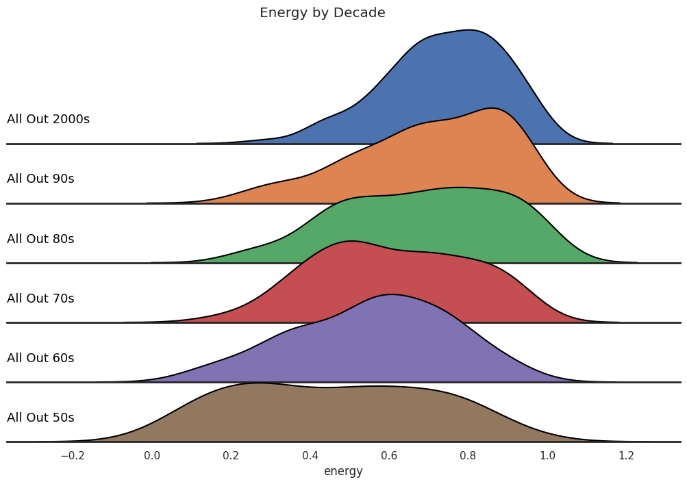
A ridge plot can be used to illustrate how popular music’s energy level has changed through the decades. Here, we’ve used the decade-themed playlists to represent snapshots of popular music over time. Note that average energy level of popular music is increasing in time, while the energy’s variance seems to be decreasing a bit. To my point above?
FacetGrid(). Image by the author.Finally, we can use a single scatterplot with additional characteristics (indicated with size and color qualities) to visualize relationships between several quantitative features. The following plot illustrates 4 quantitative features at once! Note the trends: quieter, less energetic tracks tend to be more acoustic and sadder (associated with lower values of valence).

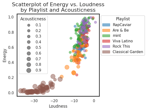
scatter() method with numeric size and color flags. Image by the author.It’s also possible to include a categorical variable in the mix with the scatterplot. Here we return to partitioning the analysis by a subset of the playlists (the same one used in the pairwise scatterplots in Figure 3). Note that this plot contains a lot of the same information illustrated in the upper-left pairwise scatterplot in Figure 3. The only differences are: (1) the swapping of the coordiante axes, and (2) the additional size attribute. Note the trend: classical music tends to be more acoustic — no shock there!
scatter() method with both a size flag and a categorical color flag. Image by the author.Any of the plots included above can be modified to include your favorite playlists or features — have fun!
Future work
I plan to extend this project into an interactive Dash application which enables users to visualize trends in the audio features of their own Spotify playlists and favorite tracks.
